Making OOI’s Website Accessible to All

Accessibility means different things to different people. When visiting a website by the visually or physically impaired, accessibility means the difference between being able to navigate and understand the site or getting lost in a labyrinth-like design with literally hidden pitfalls and navigational traps.
In redesigning OOI’s website, making the site accessible and easily navigable to all visitors was a top priority. “Websites are all about the user experience. It’s not simply about building something to experience the beauty on the screen, but rather building for everyone trying to access that information and treating them equally,” explained Nate King, web developer with Trapeze, the firm which designed and coded the new site.
“To be perfectly accessible, there would be very little design, most websites would consist of simple text on a screen. But there is a reason we put beauty into websites and that we please people with what is seen on the screen. That doesn’t mean that beauty and the experience have to be at the expense of accessibility. They can be intertwined as we have successfully done with OOI’s new website.”
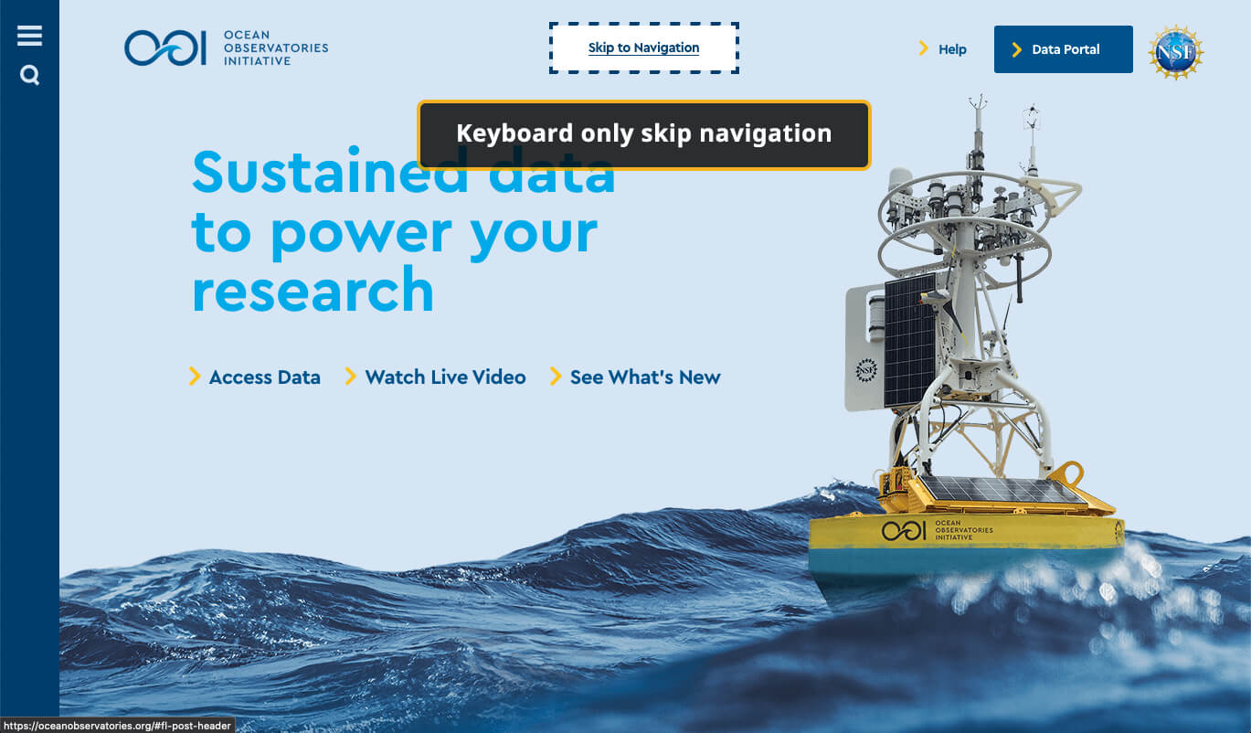
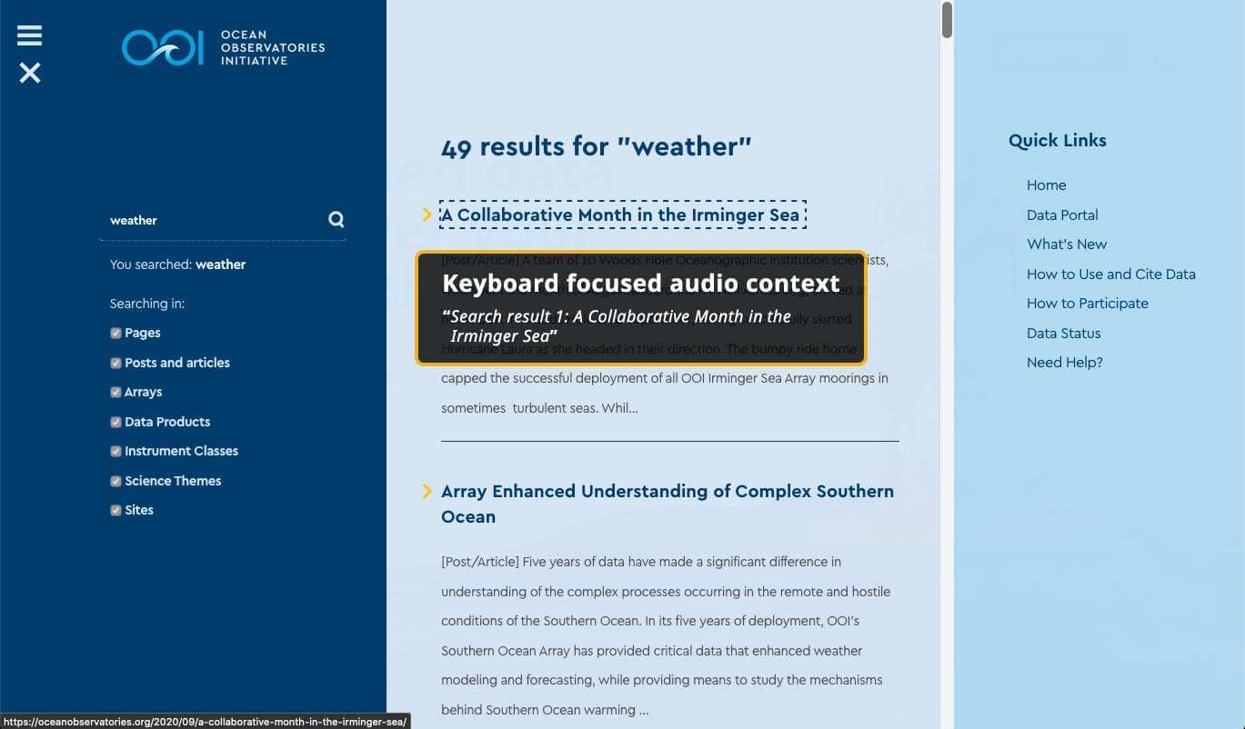
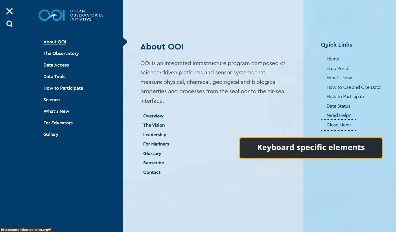
King used a three-pronged approach to make OOI’s website accessible to those with visual, and other physical limitations. He developed a navigation system for keyboard users, who do not or are unable to navigate using a mouse, which takes them through the content in a logical way. He also incorporated audible-only information into the design that will help those who are blind or with other visual impairments navigate the site by providing context regarding its organization and logic when using screen reader technology. Lastly, King worked with the designers to ensure people with visual impairments such as color or partial blindness could successfully navigate the site and be able to differentiate its various components.
“As long as you put the time and effort into it—preferably from the outset—a site can be both beautiful and accessible, which we achieved here,” added King.
The OOI website represents a high standard for accessibility as it attempts to meet or exceed the Web Content Accessibility Guidelines (WCAG). Meeting such accessibility guidelines levels the playing field for all visitors to the website, giving every visitor to the site equal access to the information.
King further explained that the OOI site was designed with a logical approach to enhance its accessibility. For example, headline sizes/styles are used in a predictable way—headings contain semantically correct structure, the single H1 contains H2 headlines which in turn contain H3 headlines—rather than choosing headline sizes based on the designer’s preference. The accompanying audible information guides the visually impaired and provides context when visiting the site, better explaining the navigation of the site, how the site is referenced through search, and where the visitor will land next. And, the OOI website’s design allows for magnification up to 200 percent to provide more visitors with the opportunity to experience and explore the site. “A website is not a piece of paper. It can expand, contract, and offers up all sorts of ways to get information to visitors,” said King. “We are delighted to have used an empathy-driven design methodology to help OOI make its site accessible to all.”


