Plotting Glider Transects in Matlab
In this tutorial, we will make some quick transect plots of Glider CTD data (which are also sometimes called section plots or profile timeseries). We’re going to use the same data file as the NetCDF Tutorial, so if you want to follow along, take a look at that tutorial for more information on how to obtain and open the file.
First, let’s specify a variable which points to the file we have already downloaded so we don’t have to type it out every time. Then we’ll load in the data that we want to use.
filename = 'deployment0004_CP05MOAS-GL387-03-CTDGVM000-recovered_host-ctdgv_m_glider_instrument_recovered_20160404T190109.208590-20160714T010519.309690.nc';

% Load in time and convert to Matlab time
dtime = ncread(filename,'time');
dtime = dtime/(60*60*24)+datenum(1900,1,1);

% Load in a few selected variables
pressure = ncread(filename,'sci_water_pressure_dbar');
temperature = ncread(filename,'sci_water_temp');
salinity = ncread(filename,'practical_salinity');

% Remove some bad points
temperature(temperature==0)=NaN;
salinity(salinity==0)=NaN;

% Pull the source attribute to use as a plot title
source = ncreadatt(filename,'/','source'); %Get the data stream's name
Now that we have the data, we can make some pretty plots.
% Colored Scatterplots
subplot(2,1,1)
  scatter3(dtime,pressure,0*dtime,12,temperature,'.');
  view([0 -90]);
  datetick('keeplimits');
  ylabel('Pressure')
  title(source,'interpreter','none')
  cbh=colorbar;
  ylabel(cbh,'Temperature (C)');
  set(gca,'fontsize',8);
subplot(2,1,2)
  scatter3(dtime,pressure,0*dtime,12,salinity,'.');
  view([0 -90]);
  datetick('keeplimits');
  xlabel([datestr(dtime(1),'mmm dd, yyyy') ' to ' datestr(dtime(end),'mmm dd, yyyy')]);
  ylabel('Pressure')
  cbh=colorbar;
  ylabel(cbh,'Salinity');
  set(gca,'fontsize',8);

set(gcf,'PaperPosition',[0.25 0.5 8 5]); % Add 'renderer','opengl' if necessary
print(gcf,'-dpng','-r300', 'tutorial2-fig1.png');
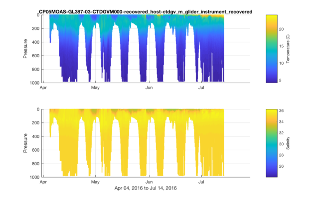
For these plots, I used scatter3() which plots every point as an individual dot. An alternative approach is to use the combination of meshgrid(), griddata(), and pcolor(), but because griddata() interpolates across all data points available, we would have inadvertently filled in the lower depths with erroneous data values when the glider wasn’t in deep water. scatter3() avoids this by just plotting the data we have.
However, because scatter3() is designed for plotting 3D datasets, we actually need to pass through an array of 0’s for the 3rd dimension, so we use 0*dtime. Adding view([0 -90]) shows only the 2 dimensions we want (in this case, depth and time), and the -90 automatically flips the y-axis for us so deeper waters are on the bottom.
Note, if you are plotting a smaller (or larger) time range, you can play with the marker size (the value 12 is used above) to see what works best for you.
Finally, a note on the labels. I’m using the “source” metadata attribute as the title. Because it includes a lot of underscores, I set interpreter=none, so Matlab won’t automatically uses those underscores to convert letters to subscripts. I also like to use xlabel() to output the full date range of the dataset shown, because it might not be obvious from the axis tick marks.
Subsetting Data
While the above example grabs data for the full range of time in the dataset, if we only want a subset of the full dataset, we can add additional parameters to the ncread() function to identify the specific data we want to extract. Specifically, we need to add start, count, and stride as input parameters.
In order to figure out which data to extract, we will first pull the entire time range, and then use that to figure out the specific indices we want.
In this case, we’ll set stride equal to 1, so we get all of the data. We also need to figure out the count parameter. In this example, we could use length(ind), but a better choice is ind(1)-ind(end)+1, will work even if we change the stride value to some other step.
% Specify the start and end dates
start_date = datenum(2016,6,15);
end_date = datenum(2016,7,14);

% Extract the complete time record
dtime = ncread(filename,'time');
dtime = dtime/(60*60*24)+datenum(1900,1,1); %Convert to Matlab time

% Figure out which data points are within the time range, and subset the time variable
ind = find(dtime>=start_date & dtime<=end_date);
dtime = dtime(ind);

% Now read in the other variables with just the time range we want
pressure = ncread(filename,'sci_water_pressure_dbar',ind(1),ind(end)-ind(1)+1,1);
temperature = ncread(filename,'sci_water_temp',ind(1),ind(end)-ind(1)+1,1);
salinity = ncread(filename,'practical_salinity',ind(1),ind(end)-ind(1)+1,1);

% Remove some bad points
temperature(temperature==0)=NaN;
salinity(salinity==0)=NaN;
Now, we can make a new plot.
figure(2)
subplot(2,1,1)
  scatter3(dtime,pressure,temperature,12,temperature,'filled');
  view([0 -90]);
  set(gca,'xlim',[start_date end_date]);
  datetick('keeplimits');
  ylabel('Pressure in dbar');
  title(source,'interpreter','none');
  cbh=colorbar;
  ylabel(cbh,'Temperature ^{\circ}C');
  set(gca,'fontsize',8);
subplot(2,1,2)
  scatter3(dtime,pressure,salinity,12,salinity,'filled');
  hold on;
  view([0 -90]);
  set(gca,'xlim',[start_date end_date]);
  datetick('keeplimits');
  xlabel([datestr(dtime(1),'mmm dd, yyyy') ' to ' datestr(dtime(end),'mmm dd, yyyy')]);
  ylabel('Pressure in dbar');
  cbh=colorbar;
  ylabel(cbh,'Salinity');
  set(gca,'fontsize',8);

set(gcf,'PaperPosition',[0.25 0.5 8 5]);
print(gcf,'-dpng','-r300', 'tutorial2-fig2.png');

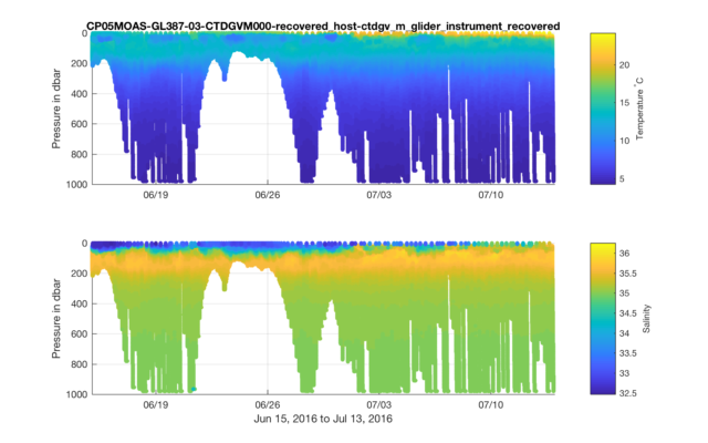
Figure 2. Transect plots of temperature and salinity, showing a 1 month subset of data that was depicted in Figure 1.
Improving the Colors
Now we have some cool (or rather cold and warm) glider data, but the colors are not ideal. If we were creating this figure in Python, we could use the suggestions provided by cmocean, but another good choice are the colormaps provided by ColorBrewer. An easy way to add ColorBrewer colormaps to your scripts is to download BrewerMap from Matlab’s File Exchange.
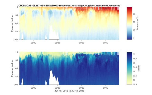
While we’re at it, will make a few other adjustments to the plots to clean them up, and we’ll also zoom into the top 200m which is where most of the action is.
% Add BrewerMap to the path
addpath BrewerMap

% Update the plots
ax1=subplot(2,1,1);
  colormap(ax1,brewermap(64,'*RdYlBu')); %Red-Yellow-Blue
  box off; grid off;
  set(gca,'tickdir','out')
  set(gca,'ylim',[0 200]);
ax2=subplot(2,1,2);
  colormap(ax2,brewermap(64,'YlGnBu')); %Yellow-Green-Blue
  box off; grid off;
  set(gca,'tickdir','out')
  set(gca,'ylim',[0 200]);

set(gcf,'PaperPosition',[0.25 0.5 8 5]);
print(gcf,'-dpng','-r300', 'tutorial2-fig3.png');
Now that we have our cool Glider plot, we can start looking into the oceanographic features and events it shows.
— By Sage Lichtenwalner, Last revised on June 29, 2017 —


